Friday 26 February 2010

OMG, I won a competition for one of my cards!

I am in shock!  I was doing my usual "I cannot be bothered starting anything new, (including housework or dinner) so I will just take a look at all my favourite sites on the puter, including Little Paper Shop, and guess what - when I got there, my card was staring me in the face - I had won the challenge on producing a distressed card. My heart nearly left my body and I am still shaking 10 minutes later. WOW. Mmmm, does that mean I cannot enter the next colour challenge?  Am not sure what the 'netiquette' is here.........

Anyway, I have had a busy week - HUB and I are planning on a kitchen renovation sometime in the middle future (as opposed to next month) so were looking at whitegoods for one day, and as I have auditioned as a reader for a local radio station for the print handicapped and have been accepted, I had to go to a learning session on another day - had to get up early as well!  In addition, I took an afternoon relief teaching session (would you  believe DANCE) and so I have not had as much time in the workspace.  Have made a couple of cards, but have handed them out already without taking a photo, and have got two new ones left.  Here they are.

Somewhere I was shopping I found a packet of vellum butterfliesby Cre8tive and thought they looked sweet; they were cheap so I bought them and put them in my stash.  The other day I took two out of the packet and wondered how I could make them look more than a simple white vellum butterfly.  I looked in the cupboard and saw my little collection of mica paint daubers by Moonglow (Lindy's Stamp Gang), so got out the blue and the green ones and then the pink and the orange one.  I daubed one with blue and one with green.  I used the orange or the pink to gently touch the outside of the wings of the butterfly, rather then really smash it on.  As they dried they began to look quite pretty but I thought some gold would be good, so I sprayed them with Moonglow Gossamer Gold mica mist, and then while still wet sprinkled it with fine glitter. When they dried, they looked very fragile and pretty. I used deep pink pearls for the body of the green one and blue jewels for this one (see close up below). The hardest thing was trying to get the scalloped rectangle cut out, as I do not have a nestie for this, so I used my SU scallop punch and tried to line it up.  The background paper is a piece of SU DP Patterns in Pacific Point. The blue lace was purchased off a street stall in Euchua in northern Victoria, while on holiday last year.  (I got a couple of metres each of about 6 different colours. Always keep your eyes open for stash!). The blue checked ribbon is from Joanne Craft Essentials (USA). The rub-on is a Cre8tive one. The pale blue background paper is Franchville  but I don't know its name.

The other card is an idea from a picture I had cut out of a old magazine a while ago, where these little tags were used with rub-ons to create en embellishment.  I rubbed on the words and then walked away for a few days before coming back and changing my mind about how I would use them.   I ended up by cutting circles out on the Cuttelbug using Nestabilities Classic Small Circles, cutting them up  and arranged them on a card blank (this blank has a slightly raised embossed surface); and then found my dusty collection of eyelets (had to relearn how to place these as I tend to use brads instead nowdays).  After getting out my pretty little hammer and bashing away, I remembered I had a collection of little charms from Heidi Grace Pocket Scraps somewhere and after finding them  I tied one on with yellow string. I then had to cover up the eyelet holes on the back inside of the card, so decorated it with the left over Franchville Green Swirl.


Sunday 21 February 2010

Stamp Camp Afternoon

Yesterday it was hot and overcast so the best place to be was indoors in airconditioning at Lynda's place with Lynda and Claire the InkiDivas, doing a Stamp Camp.  It was advertised that we would make 12 cards in 4 hours - mmm, well I knew that wasn't going to happen for me, I take too long to make a card, but I did make enough of 12 cards to be able to finish them off at home today in an hour. So, 12 cards in 4 hours plus chat, eating, cups of coffee making......not too bad!  The ideas are not mine, and the stamps, punches and inks were not mine, and some stuff had been already cut out for us (ie the paper strips, squares and circles and bits of ribbon, twine) as well as the card blanks....yes, yes, I know - add another couple of hours to the making.....look, I was feeling good about the industry before you started! Anyway, here they are - I think they look fine!


We started on station one making these girly cards and stamped the same image onto Whisper White circles with StazOn Black, using the Stamp-a-Jig from SU. The circles had been cut using Nestabilities. We coloured them in using watercolouring pens and SU's watercolour pastels. They are quite subtle. Next was stamping small cupcakes in a random pattern across the base card.  Now, random is a difficulty for me - it worries me while I do it and never looks that good when I finish - however, I got over that and proceded to layer up the various pieces of DP and card - the colour combinations are not my choice but I love them, particularly the green and turquoise cards. When I got them home I finished off the two cards I had not put together, put an inset in, and then used Dimentional Magic on 2 cards on the icing and some glitter pens and glitter on the 3rd.  You see if you can work out which is which!


Oh, yes inked edges and Lynda kindly poked holes into two circles for me as I was running out of time at that stage on that station.


Next station was a boy card and we made stars.  Sorry, the photo is a bit blurred. Again the pieces of card had been cut out for us, except for the stars, and that was demonstated to us first, using two different size star punches. Then we stamped onto the canvas tape and onto the background card.  The backgound was the large Sanded stamp. We cut out the nitches on the bottom card, using another punch and placed the twine pieces across these, tying them together with a third piece; and then assembled the whole using various DPs, combining the outline stars with solid stars and putting them on where we thought they looked the best!

More stars - white card strip, punched with star punch and then layers of ribbon place over the aperture with tape on the reverse side.  This is a good way to use up ribbon scraps, I thought to myself. Stamped the sentiment (or, if you are me, don't until it is all assembled and you realise this is not going to be easy!) and used the markers to draw faux stitching around the star shape and edge of white. Layer up and it was done. The white top is layered with dimentionals to lift it up slightly.  I didn't complete the third one until I got home, and I used a rub-on instead of the stamped sentiment on that for a bit of variety.  I also stamped a star inside each card on an insert piece to complete it.


The last set used the new stamp set, Butterfly Prints in the summer Mini catelogue and the butterfly punch. Also used circle punches and after working out that I had to use different size circles to punch out my DP and another in card for the centre circle (I actually punched out six more circles of the larger size before I realise my error - sorry Claire) we used a background stamp polkadots to create a background on the card. Next was to stamp the butterfly onto vellum, and punch that out along with a matching butterfly from card to back the vellum one. Construct the butterfly using a brad to join them, and a dimentional pad to lift it on the circle. Stamp a sentiment and then distress the strip before adding it to the background card; assemble the circles, and add to the strip along with the butterfly in the middle.  At home I also added an insert paper of creamy white. Pretty.

Friday 19 February 2010

We have had the most beautiful late summer weather lately - lots of blue skies and sunshine! I have been doing a variety of things BUT I have also been scrappin cards - continuing the task of being inspired by cards created in January's UK Magazine CARDS.  I have tried some new techniques and learnt a few things that I cannot do as well as can do - and expanded my repertoire in thinking about what can be done where along the way.  Here goes:


This one is made of strips of paper embossed in some of the few embossing powders I have - it was SU Confetti with a punched edge (Fiskars) layered onto grey-blue card, and then lilac and a base card of pink. Three buttons and a sticker completed it. It didn't take long to make and I think it looks really classy.  My embossing powders are all subtle and so it has a vintage look.


This does not look as good as the one in the book - that was lucious - but I had a go at freehand cutting and making flowers and while it is not a technique I am confident with, with the proper papers I think it would be good. These are scraps and I stamped them with background stamps - SU Sanded and Lace and an Image Tree script stamp.  I used SU inks that were about the same colour or deeper than the card.  I cut out the flower shapes freehand and then sprayed then with water, scrunched them and flattened them again to made up two flowers, with a pair of brads from Cloud 9  - Brittany's Castle. The Friends square brad came from the same set. Some pink ribbon over some brown card, which had a scalloped edge top and bottom (cannot see the top) and my sentiment was from Waltzingmouse's set - Irish Blessings. So is the shamrock and both are stamped in SU Pink Passion on craft.


This one looks simple but took me hours - I was running out of steam!!! I had the teapot in a set of stamps by Tim Coffey, called Daisy Delight.  It has a pretty little butterfly in the set as well, and I have used that a few times and a leaf once but not anything else - and this is one of my first ever stamp sets. Anyway, I stamped the teapot in SU Ballet Blue, on Whisper White card, cut it out and then stamped the image onto the background card, masking the teapot first. This left the steam curls on the background paper (I used scraps), and I then layered the teapot next to it using dimentionals. My sentiment came from a pack of clear polymer stamps (no idea) and the stitches were from a packet of rub-ons. A couple of buttons, and some pretty ribbon, and it was done.  The casing of this can be seen clearly but it is not at all like the origional - I thought mine was a bit 'mmmnn - bland' myself....... BUT, I did have a go!

This was my attempt at a very pretty scallop card in pretty vintage cards of pinky fawn and blue, with green highlights.  Mine is not as dainty. I had a DP piece from Rhonna Farrer called In the Round so used that to get some scalloping going - I had a scrap piece of Vintage Moon collection - Moon Glade by Holly McCaig which I used and a sticker for the sentiment.  I stamped a flourish using SU Baja Breeze ink from the SU Baroque stamp set and a chipboard flower which I had painted, sprayed with vintage mica inks and then wiped this off and decided to lightly emboss with a bronze embossing powder. All on the yellow card SU Barely Banana, with a ribbon trim on the base of the card and some bling bits as well as yellow satin ribbon.


This next card had been made back in January, but never completed. I used a peel off on to acetate sheet, then coloured with alcohol inks (I tried severl different types of pens before I got some to stick and stay) and then put into a window in a plain white card.  I use gold trim peel-offs to make a window frame.  Inside the card I stamped a 'branch' using a flower from the SU Oh , So Lovely stamp set and SU markers.  I made it so the bird seemed to be perched on the branch when the card was shut. An interesting experiment.  The inside of the card was then covered with DP scrap. The sentiment comes from SU Pocket Sillhouettes.

Monday 15 February 2010

Rainy Days.....

Yesterday it was rainy in the morning and so I spent the time playing!  I purchased the latest edition of the UK magazine Cards  a few weeks ago and while I have read it from cover to cover, I had not cased anything much out of it - so decided to work through page by page to see if any cards there inspired my mojo to compete - and this is the result!  I am only through the first 10 or so pages. Have also added it to the Little Paper Shop Monday Challenge LPSC55 - Distressing:


I used their colours and idea of the 'quilt' but my stiches are faux and my flower is not the same - I also like the way that two of the squares sat off as if unfinished or as if the butterflies had knocked them askew, rather then the uniform one is the magazine.  My butterflies are not the same either.   The butterflies are from two different stamping sets, coloured with SU markers and then coated with Dimentional Magic to make them shine. The feelers were drawn in after they were fixed to the card front. Cuttlebug embossing on SU card used and a brown SU marker for faux stitching. The stem and leaves were rough cut out of scrap card.


You can see the faux stitches here and the fussy-cut butterfly, and the embossing.


Next one was using buttons - I am always reluctant to use too many in fear of using up my stash but in reality I have so many it makes little difference to the stash pile!  I had to use the bottom of a 'y' letter to make my inverted comma and I think it is upside down now I look at it! An embossed piece of card (Swirl) which has the scallops punched out of the bottom edge. Some SU designer paper scraps and we were away. The letters are left overs on a set of big chipboard letters I have in the stash without the name of the manufacturer on the sheet. 

The next one had a simple flourish on craft and three flowers of felt with button centres and a big single letter 'K" on the right hand side.  Mine is a little different but is inspired by the same design.  Yes, I use the SU Baroque  flourish, but the felt flowers I have are only pink and white and I wanted to use the autumn colours here, so I just used three yellowish flowers and added three different buttons.  I then decided to sponge some Old Olive everywhere and add the red ribbon to lift the design. The 'O' is not quite big enough and looks a little out of place - it is meant to be given to a friend whose first name starts with 'O'. So, its like the one in the magazine, and its not.


This one was inspired by a series of flowers across a ribbon in the middle of the card, with faux stiches aroung the petals.  I don't actually have a flower stamp that suited that idea, but I do have this stamp.  It is a Stamp-It one called Framed Daisy Trio, and it thought I could stamp it several times and cut out the flowers and make them string across the middle, but I then had a better idea. After colouring one set in completely using SU markers and chalking the paper to make it more suited to the colour scheme, I then coloured in just the flowers from the second stamped set, and fussycut them out; attached them over the first ones and coated them with Dimentional Magic to make them shine.  They really pop off the page. I used my Fiskars punch to create the border on the bottom of the yellow card and my background papers are from the scrap drawer. I used some green card instead of ribbon across the centre of the card behind the stamped image, and again inside the bottom of the card so that it showed through the decorative cut. Some black Thickers for the sentiment and I was pleased with the result.


I then decided to change the colour scheme and ended up going pink because I could find several different things in pink to embellish the card with - wonder why? The sentiment is from a Verve stamp set and the bird is from the SongBirds stamp set from TJ Designs.  I used SU Pink Passion ink and card and layered up with a piece of teal card from somewhere! I used the computer to generate the saying and then punched the edge with the Fiskars punch. Some other bits and pieces, and some black ribbon from the inside of one of my jumpers, and it was done! I tore the edges of the paper and deliberately glued the ribbon on less than carefully to make it look avant guarde!


This is the last one - some layering up required here.  The colour scheme and the idea came from the cased card, but the stamp used is a Hamilton Art Stamp - Watercolour Daisy, coloured (in watercolour) with the SU markers waterbrushed. A Verve sentiment stamp, onto white Bazzil and layered onto blue; and 4 orange sparkly brads; layered onto Confetti Kaleidoscope Suprise "Cousins" Flowers DP, orange bazzil, SU Whisper White all on top of a blue bazzil card base.  Now I look at it I need to have shortened the flower topper a little to make it fit better on the orange base.

Better go, the girlies have arrived for their regular Monday night roast (Roast Beef tonight) - and NO homework tonight!  We might go for a walk!

Thursday 11 February 2010

Little Paper Shop Challenge

Another colour challenge from the Little Paper Shop.  This one is red, white and black and could include Valentine's Cards if wanted.  I chose to do a Birthday Card. It is inspired from a card seen in the UK magazine Cards - January 2010, although the colours have been changed and I gave it more of a amateur feel!  I now notice my stamping is well off-centre with the small flower as well - didn't think it was too bad while I was putting it all together! Anyway, here it is...........


I used a SU stamp set called Think Happy Thoughts and SU Whisper White paper, SU Black paper, SU Riding Hood Red paper and ink.  The red glitter on the cake is a cheap rought chopped glitter and the and the ribbon is ......ribbon! Background Paper was from a DCWV  All dressed Up matstack.  Red Kaiser pearls and and SU Circle Scallop punch outlined with black marker makes the flowers, and the base was embossed with a Cuttlebug folder Swiss Dots. The cake and the flowers were also embossed with a Hearts folder from Cuttlebug. That's the advertising! 


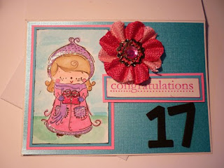
I also made a card for my eldest grandchild's 17th birthday yesterday - how old does that make me feel! I used a SugarNellie stamp  - Lola with Gift - I have had for a few months but not yet inked up - it is for winter rather than summer but the little girl is cute, so I went with it anyway  (don't you love the way these stamps from Sugar Nellie come with an Adoption Certificate??!) Pink of course  - she is a pink and purple girl - and I tried to keep it simple. I used my SU markers to colour her in and the SU set Congrats for the sentiment. It was completed with a large Prima Flower Embellisment. Papers were from the scrap section of the stash - and the foam numbers were Thickers. It was all based onto a  SU Pink Pirouette card.  That's it today folks - my HUB is waiting for me to create the stirfry for dinner, so had better shake those tail feathers!

Monday 8 February 2010

More Valentines....

I found some acetate sheets and so had to make another box, but this time I thought I would make it for Valentines Day rather than Easter, so I fiddled with the templates and created this!

It is filled with Colombines, and as their packaging is pink and blue (girls and boys?) I decided to stay with those colours and use a blue card insert (SU Tempting Turquoise) and some paper from a ministack from Creativ - Romance Series (it was pink!) I picked up cheaply at K-Mart. I stamped a stamp from SU's I (heart) Hearts using SU ink Pink Passion rolled in Ballet Blue and then stamped on Whisper White card and cut out. The ribbon solved the way I was going to close the box as I had not allowed quite enough foldover to keep the lid down and was contemplating having to use sticky fixes when I realised I could use the SU punch and thread the ribbon through it and tie a bow on the top! Easy-peasy....

I used a Waltzing Mouse sentiment stamp on the back from the Sweetheart set.


Then I thought I would put up some cards I made a few weeks ago using a paper that was free in the back of my magazine Australian Scrapbooking Memories - it was very muted pastels and pretty design with heart flowers and nice swirls.  I had several different bird stamps and I saw a card in another magazine that used a stamped bird image on a printed background.  So I got them all out and had a play.  This is what happened.
This card used stamps from SU set called Always and a sentiment from Waltzing Mouse's set Blessed by You.  A few flowers, some SU Chocolate Chip ink and it was done!  I put the paper front onto a long card made from SU Very Vanilla. 

Same paper background but from the other end so colours were different.  Here I used a stamp from Elusive Images that was free on the UK magazine Craft Stamper recently.  I tried to stamp over the existing heart on the pattern and then used the flowers over the blue hearts on the pattern. The ink was Su Chocolate Chip. The white flower has a pearl centre and the sentiment comes from Waltzing Mouse - Blessed by You again.  A bit of green organzy ribbon to finish and I thought it looked quite good! the background card is a piece of blue bazzil and then this is attached to a card created from SU Confetti White. You could use this card for Valentines if you wanted to or simply as a Thank You card.

The third card was made by stamping many flower stamps I have from a variety of places (too many to name) and a little bird from T J Designs - Song Birds set.  Add some flowers and some jewel brads from SU, backed the grey paper on a piece of green scrap and then all of it on another piece of the background paper and stamped 'thank you' from the SU set For a Friend, mounted it all on a white card blank and 'Bob's your Uncle'!

Sunday 7 February 2010

A Sketch Challenge

I have been doing a challenge across at the Little Paper Shop and have made several for the sketch challenge ending tonight, none that I really like - but I have decided to put this one in anyway. 


I have used paper from the my booklet of DCWV Adhesive Paper prints and a chipboard sentiment from a set that was a freeby on a magazine a few years ago and has been hanging around for ever in my stash.  The flowers, a button to match, some scrap orange bazil and the stamped sentiment from my SU set One of a Kind was also included. I used SU pumpkin Pie ink to stamp it and a commercial card blank. Nothing inside it yet. There is a scalloped circle behind the flower but my SU punch was not big enough to show clearly. I struggled with  this sketch and didn't know whether to case the design or use it as an inspiration and so my card is not very inspiring - no 'mojo'. However, 'here tis'.


Thursday 4 February 2010

On a Roll.................

While I was on a roll, I also made another card that is from a template off Splitcoaststampers called an easel card.  Again this is 'cased' from Crafty Squirrel

The card is SU card - YoYo Yellow - and a Bazzil card scrap of green.  The edging on the bottom of the green was punched using a Fiskar's punch. The yellow card has been embossed by a Cuttlebug folder Hearts and the green card through a Cuttlebug folder Floral Fantasy.  The circle was cut out and embossed using a Spellbinders nestie - standard circles small. The heart is stamped in SU Riding Hood Red on Whisper White card and then cut out and layered on another stamped heart, from the same SU set - I (heart) Hearts. The first heart was then coated in Dimentional Magic to make it shine and pop. The sentiment on the red circle is stamped with white ink and embossed and comes from Waltzing Mouse's set Sweethearts. The glittery 'love' word is in foam and came in a packet of pink lips and pink and red hearts, all glittery, from K- Mart. Three bits of bling were added to also make it pop. and some ribbon. 

Inside the card is some marbled paper and another heart. The ribbon keeps the card from sliding shut and makes the front sit up, like on an easel!!

I think I would do this in another colour combo next time - I was really just using scraps I had to hand with the embossed card, and the red circle and it seems a little stark. However,.....that's it folks!


It's HOT and muggy here, and overcast.....but I'm thinking Easter

I have the fan going in the craft room and the air conditioner going upstairs and I am still HOT. However, the washing is dry and the vegies are growing - there have to be some consolations!

I purchased several rolls of ribbon somewhere lately - I think it was K Mart - in an acetate box with a card inserted in the top to hold it all in place which told you who made it etc.  When I took out the ribbon rolls, I found the template for this was easily copied and conceived the idea of making an insert for Easter and filling the box with eggs for a gift. The insert had a small box on the top and then a long flap that inserted down one side of the box, leaving three sides clear to view the contents.  I then also took the box apart and copied the template for that as well with the idea of making some more boxes from scratch and not just recycling!  All I need to do is find out where I can get some acetate. I have a limited number of Easter stamps, so used them  - and here it is:
This is the original insert which I used as a template

This is my insert, looking at it from underneath - I thought I could write on the long down piece


Sorry this is blurred but this is the other side of the down piece and will be viewed from outside the box


This is the top of the insert, and will be viewed from through the top of the box


And this is what the box looks like with the insert but without the goodies at this stage. 

I put a bit of yellow card around the sides of the top but you could write greetings or do more stamping.  I used some DCWV Adhesive paper prints scrap to back the stamped image on the down strip.  The stamp was purchased at the $2 shop a few years ago and I coloured it with SU pens and then put some glue on the chicks and sprinkled various colours of glitter over each one to make them shine a little! The top image is from a rubber stamp that was a freebie several years ago from the magazine Craft Stamper (from the UK - I have a subscription to this now and the stamps are now polymer and are original designs from some of the better stamp designers in the UK - I love getting it each month). The image was also coloured with SU pens and the card is SU Whisper White.

I made another Easter card as well, from a template I looked up on the Splitcoaststampers site. It is a 'case'  from Crafty Squirrel.  Again, I was limited with the stamps available, and the card I used is too thin really to support this shape but I will make it again now I know how to do it. I stuffed up the sentiment section and had to cover over the mistake with paper and just wrote on the paper piece rather than stamp anything - I really need to get some good Easter stamps! The circle contains an image from the silly chicks, cut out and glued onto SU Whisper White, and then onto a circle in SU Riding Hood Red.  The kissing chicks were similarly layered and both images were coloured in using SU markers. The paper is scrap from somewhere and the yellow card is from a pile given to me - and I have no idea of maker.  It is not as strong as SU card however.